My Blog List

Tuesday, November 30, 2010

Option Pain – Not that great, but worth a look.


Option Pain causes stock prices to fluctuate around the option pain level. This means that if stock prices are currently above their option pain levels (let’s call this PAIN), then the big boys will somehow force stocks to trade lower.

- this was taken from https://files.nyu.edu/bk940/public/index.html (my website for a school project)

If stocks are trading below PAIN, then this presents a good buying opportunity.

Examples of option pain…
MGM was trading at $11.75 on the Wednesday before the Feb option expiration day. On expiration day, the stock opened at 10.65 and traded upwards, closing near the option pain level of $11. See below for the Option Pain level (it is the level with the least options sold).
Observe that during OPTION Expiration week, when the stocks prices are above the PAIN, the manipulators try to pressure the price downwards. There are many examples of Option Pain.

Mgm Option Pain

See how MGM stock traded downwards and fluctuated around its option pain at $11.

MGM Chart

Here's another one.

JPM Option Pain

Guess where JPM traded at option expiration day?
ANS: $40!

What is option pain…

Option pain is a theory that Option Sellers would want their Options to expire worthless, killing the Option Buyers. Stocks would hover around the Option Pain level, which is the value that would give the most losses to Option Buyers. 

The theory suggests that Option Sellers have high control over the market as they are usually the BIG BOYS a.k.a  HEDGE FUNDS, INSTITUTIONAL traders and BANKS. This is why they are able to manipulate the market.

So what's the trade? How do I use option pain?

Before option expiration week (usually the 3rd week of each month), look for the option pain value of stocks using optionpain.com, if stocks are trading above the option pain value, don't buy them. If stocks are trading below the option pain value, buy them!

Does this really work?

Option pain is just one of many theories. It may not work 100% of the time. However, it does give one an upper edge. At least, one is able to ride stock rallies with the big boys, who will usually drive stocks upwards towards the option pain level.

Do remember that market fundamentals may disrupt the option pain theory. For example, the abrupt weakness in the markets that unravel itself in early MAY 2010, caused all option pain level to be distorted at a high price. Stocks would still continue its dive downwards despite the OPTION PAIN being higher that their prices at that time.

It is very important to understand that the market fundamentals can distort OPTION PAIN level.. Especially abrupt changes in market sentiment.

This is why it is also important to learn about the MARKET CYCLE

Wednesday, November 3, 2010

MACROECONOMICS Cartoon Lectures MODULE 2 Part 1

These are some Cartoon Lectures that should help you understand Macroeconomics better. Good for those who have no clue as to what is going on in our macroeconomics lectures. Cartoons are much better appreciated. PART 2 was posted first, it is right below this post.
Hope this helps with your preparation for the exams.


INFLATION AND PRICE INDEXES

MACROECONOMICS cartoon lessons PART 2

AGGREGATE DEAMAND AND AGGREGATE SUPPLY

MONEY AND BANKING

Friday, October 15, 2010

SWING TRADING

WHAT IS SWING TRADING?

· Spend only 5 to 10 minutes a day analyzing stock charts and reading fundamental news.

· Buying at swing lows and selling at swing highs, typical trade could last between 1 day to 7 days, though some may last 30 days. Also consider shorting stocks at swing highs and cover at swing lows.

· Mostly TECHNICAL ANALYSIS, but fundamentals are important to guide the trade.

· Begin with fundamentals— finding stocks that are fundamentally undervalued or overvalued.

· Look at the charts— look for bullish or bearish patterns.

WHY TECHNICAL ANALYSIS?

· Most professional traders used them—self-fulfilling prophecy.

· IT WORKS! Because so many pros are using them, PROS force the technical patterns to happen.

WHAT TYPE OF RETURNS CAN I EXPECT?

· 30% monthly if you are good!

· 10% monthly on average

· 10% per trade

· Why 10% per trade and yet only 10% monthly?

· You do not trade 100% of your portfolio

· You do not win 100% but only 80% of the time

· You can trade 100% and win 30% monthly if you are really good! (THIS IS RARE!)

· GREED STINKS. SWING TRADING requires discipline.

Thursday, October 14, 2010

Head AND Shoulders and Double Top. BEARISH PATTERNS

HEAD and SHOULDERS is a bearish pattern. In the chart below, the head and shoulders is shown by the 3 curve markings that I have drawn.

The neck is shown by the BLACK line that I have drawn.

The target is equal to the distance of the NECK to the HEAD, projected downwards from the NECK.

image

The DOUBLE TOP is another bearish pattern, I annotated it with the 2 pointed roofs.

The NECK of the double top is shown by the blue horizontal dotted line.

The target is equal to the distance from the neck to the TOPS, projected downwards from the NECK.

Sorry for the bad wording, but I have shown an example of the projected target using the arrow. You can see 7, that is the price distance from the neck of the double top to the TOPS. So the target is 7 points downwards.

Wednesday, October 13, 2010

Moving Average – Simple and effective

Moving Averages are very useful in a strong trending market. It fairs poorly in a sideway makret.

There are 2 types - EMA and SMA. I like both.
In my charts, I always use 10 EMA and 25 EMA together with 200 SMA.

One of the simplest strategy

When the stock is trading above its 200 SMA

1. Buy when the 10 EMA crosses the 25 EMA upwards. (SEE 1. on CHART)

2. Buy when the stock dips and trade in between the 10 EMA and 25 EMA line, followed by a break out of the 10 EMA line upwards. (SEE 2. on CHART)

3. Don't buy on 3. This is because stock dipped in between 10 EMA and 25 EMA line, but failed to break out above the 10 EMA line. There was actually a fake breakout if you look carefully. However, stop loss should have save us from any severe loss. (if you don't get it, contact me).

WHEN the stock is trading below its 200 SMA

4. Short when the stock retraced to the 10 EMA and 25 EMA line followed by a break down under the 10 EMA line.

5. SAME.

6. I did not circle it, but you should guess it... Don't SELL on 6. This is because the stock retraced to theZONE but failed to break out. Signal a possible change of trend.(let's call the in between 10 EMA and 25 EMA line the zone).

THIS STRATEGY works with good stop loss management.

With this strategy, whenever stocks travel into the ZONE and bounce back to its original trend, then they are a good buy or short.

However, if stocks travel into the ZONE but fail to bounce back, then it signals a possible change in the trend.

Use this strategy with FIBONACCI and others to make it even more accurate!

Tuesday, October 12, 2010

Fibonacci – The best trading tool!

Fibonacci

Fibonacci is one of the best technical tool as it is used by almost all traders - that's why it truly works!

It is useful in finding reversals for swing trading. It helps us to find swing lows in an uptrend, and swing highs in adowntrend.

The SEQUENCE

1,1,2,3,5,8,13,21,34,55

The Fibonacci Retracement Levels derived from the SEQUENCE

34/55 = 61.8%

21/55 = 38.2%

1/2 = 50%

13/55 = 23.6%

Trending Stocks will often retrace its move by a certain percentage, and that percentage is usually the FIBONACCI levels!

When a stock is rallying, it will retrace either 23.6% (only for very strong uptrend), 38.2%, 50% or 61.8% of its recent rally.

Look at the example below, BAC rose from $12.16 to $14.05 (that's the rally), then the stock started dipping.

This is where we use Fibonacci.

We draw the fib lines by extending it from the swing low $12.16 to the swing high at $14.05. The stock will most probably retrace to the 38.2% level, and it did. Look at the label a. the stock rose after retracing there.

However, the rally stalled, and the stock went back to that level and broke it downwards. It then retraced to the next fibonacci level 50% at b. And it bounced from there. We could see that the stock then made a run up to the 23.6% level before breaking down again, and it repeated again.

This means that Fibonacci lines are strong SUPPORT and RESISTANCE lines.

Fibonacci Retracement

Note that Fibonacci retracement only help us to predict support and resistance lines.

IN AN UPTREND

We use Fibonacci retracement to help us find swing lows so that we can buy stocks there.

The stock may retrace to the 38.2% level and bounce off from there, however, there is no confirmation that this will continue the rally. The rally will only continue if there's a 1-2-3 pattern breakout, meaning that the stock breaks the top 0% level of the fibonacci line.

Otherwise, the rally might fail as seen in the BAC chart above.

In a DOWNTREND

Fibonacci can also be used in a downtrend. In this case, it will be used to find swing highs, so that we can short stocks there. You should get the idea. Otherwise, do contact me (link is at the left menu).

How to make the best out of FIBONACCI?

Use it together with WAVE theory and the other technical tools that I teach on this website.

Wednesday, October 6, 2010

Bearish Harami Cross - Bearish Reversal

The Bearish Harami Cross Pattern is a sign of disparity about the market’s health. Market is bullish and strong buying continues as evidenced by the long, white real body but then we see the doji. This shows that the market may not continue in uptrend.

On 10/6/10, The S&P chart shows a bearish harami cross.

image A lower close or large gap down on the 3rd day is required to confirm the bearish reversal.

Saturday, September 25, 2010

Bearish Shooting Star --- LOW Reliability

image

The shooting star is a small real body characterized by a long upper shadow, which gaps away from the prior real body.

The Shooting Star tells us that the market opened near its low, then prices strongly rallied up and finally prices moved down to close near the opening price. In other words, the rally of the day was not sustained.

A confirmation on the third day is required to be sure that the uptrend has reversed. The confirmation may be in the form of a black candlestick, a large gap down or a lower close on the next trading day.


In the above example, you could see that a shooting star was formed 2 trading days ago, but failed, the current shooting star is stronger as the real body is much smaller.

Friday, September 24, 2010

BEAR TRAP ---- continued rally

A bear trap is a false signal that the rising trend of a stock or index has reversed when it has not.

The result is that shorters are trapped, and are forced to cover their positions at higher prices.

Thursday, September 23, 2010

Bearish Dark Cloud Cover


Another Bearish Reversal Pattern.

The Bearish Dark Cloud Cover pattern is a two-candlestick pattern signaling a top reversal after an uptrend or, at times, at the top of a congestion band. (as shown in the LVS chart) We see a strong white real body in the first day. The second day opens strongly above the previous day high (it is above the top of the upper shadow). However, market closes near the low of the day and well within the prior day’s white body at the end of the day.

Today, LVS made such a pattern.

image

Tuesday, September 21, 2010

Bearish Hanging Man

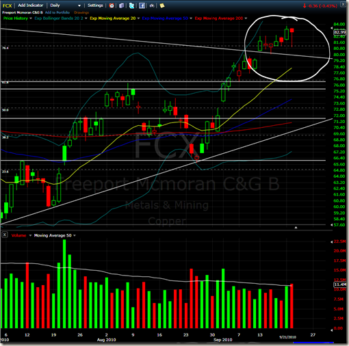
The hanging man is a bearish reversal pattern. It signals a market top or a resistance level. Since it is seen after an advance, a Bearish Hanging Man Pattern signals that selling pressure is starting to increase. The low of the long lower shadow indicates that the sellers pushed prices lower during the session. Even though the bulls regained their footing and drove prices higher by the finish, the appearance of this selling pressure after a rally is a serious warning signal.

Today, Freeport Mcmoran (FCX) made such a candle.

image

The candlestick shown is almost like a dragon fly doji, just that it has a rather larger head or candle body

Monday, September 20, 2010

Market Psychology Cycle

You might have most probably seen this picture somewhere.

The image is self explanatory.

Curretly, the DOW has exploded almost 900 points from its low a few days back. We might be at the Euphoria stage.

image

Sunday, September 19, 2010

HIGH WAVE – Bearish Reversal, Medium

One candlestick pattern per day. Learn candlestick slowly together with the market.

image


The High wave is a bearish reversal candle, but it requires confirmation.

Reliability - Medium

Thursday, September 16, 2010

Easy as 123 system. One of the best trading strategy.

The 123 system is a breakout system. Basically, we number the highs and lows of the stock.

In an uptrend, we label 1 as the first low, 2 as the high and 3 as the second low.

3 has to be higher than 1 in an uptrend.

image

When the stock rebound at 3 and breaks through the 2 level, then we go long. It is that simple!

Why this works? Read through the Psychology of Support Resistance again. Basically, when the stock rebounded at 3 and hit level 2, the 3 group of people decided to cancel sell orders and break through it, and resistance has now turn into support.

Tuesday, September 14, 2010

The Psychology of Support and Resistance

Tradedragon focuses on Support and Resistance. Here’s why.

There are 3 market players. LONGS, SHORTS and the UNCOMMITTED.

LONGS have already committed to buying and owning shares, SHORTS have already shorted shares, and the uncommitted are those who are waiting to enter the market.

Assume that the market bounce on a support area. Longs are excited, and regretted not having bought more. If the market dips near the support again, they will buy more. Short realized that they are wrong, so if the market dips to that area, they will want out. The uncommitted decides to buy on the support to make a gain on the trade.

All 3 groups have decided to enter the market on the long side. “Buying the dip”. Naturally, if prices decline near that support, these people will buy again and thus push prices up.

The BUY orders create this support level.

The higher the volume near the support, the more significant it becomes as it means that more people have a vested interest in that area.


Now when the market goes below the support, the opposite happens. All the groups change their positions. Longs realized their mistake, Shorts are excited and want to short more , and uncommitted traders decide to short the market.

So what were buy orders at first, became sell orders. This is why SUPPORT becomes RESISTANCE.


This is why chart patterns work. They are due to the psychology of the market participants and their reactions to market events.

Charting and technical analysis are studies of reactions of traders.

Sunday, August 15, 2010

Launch of tradedragonschool

INTRODUCTION

Tradedragon School reveals the trading methods and strategies that are used by tradedragon fund.

tradedragon shares his opinion about the market @ http://tradedragon.blogspot.com/

There are 10 lessons which will be posted as soon as they are available.
Basically, it covers a few important trading concepts that has made tradedragon successful. They include technical and fundamental analysis – Fibonacci, Stochastics, Bollinger Band, Moving Average, RSI, S/R, how to use CNBC + Forums, Money management and Market timing.

The school is 100% free. The aim is to get feedback about my trading method so that I can improve on it.

1st lesson has been uploaded, it is only a brief overview. Lesson 1. Tradedragon Analysis